Sorry Sans
Colophon Foundry is a British agency, therefore unsurprisingly very polite – something we appreciate. We met them the way most creatives meet — a mutual respect of each other’s work led to conversations that led to a larger dialogue and potential for collaboration. They came to visit us at our Vancouver office, and in turn, we visited them at their London office. We decided to work together on the creation of a new font – a completely new typography that would capture the essence of the Very Polite brand and personality.
The partnership involved months of meetings and the navigation of time zones (read: very early morning calls). As an agency-turned client, this was a new perspective for us. We presented a very open brief that allowed Colophon to explore a variety of styles. They came back to us with some ideas that fit in with the evolution of our brand, and the fonts evolved from there. After selecting two sketches the result was two final fonts that were dynamic, distinct and 100% Very Polite.
Sorry Sans Character Map
Work Life Balance

Sorry Sans is an Extended Bold Sans Serif that came about as a result of exploring the idea of having dual personalities coming through in the font. We liked the duality, as it complemented the contradictory personalities of our own Very Polite brand. We are casual when we talk, but formal when it comes to business (thank you very much). We are polite in communication, but bold in our intentions. We are a business first – but take our pleasure seriously.
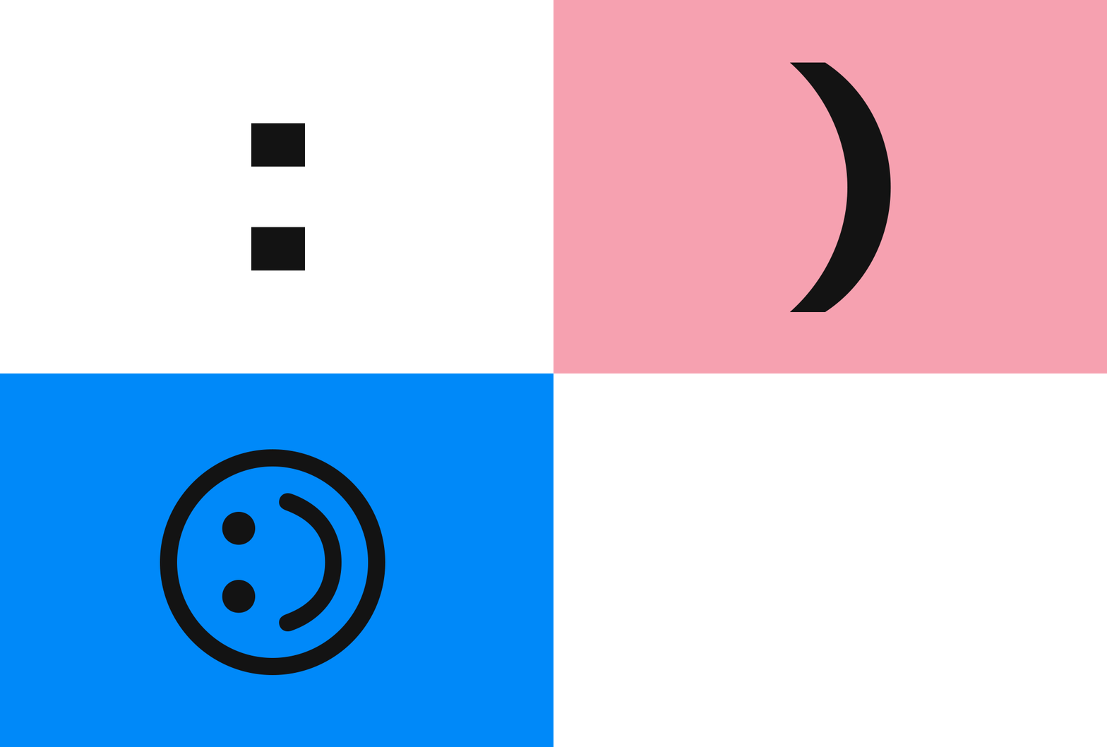
Much like these distinctions, this font spoke to the idea of contradictions. This was brought to life using different treatment between uppercase (UC) and lowercase (LC): UC has mono linear weighting (no contrast) for a conventional Sans Serif structure whereas LC shows gestural moments, for a more expressive and playful effect. The result is two faces/personalities within the same typeface. The uppercase of Sorry Sans is formal, utilitarian and direct, while the lowercase is more expressive and playful. The lowercase carries more character, even infusing custom symbols (Emojis, Registered, Trademark) and features (contextual alternates) to inject further personality. Previous to this, we had never used lowercase in our communication, so this was an opportunity for our language to embody more depth and nuance. Added details such as tight spacing for impactful headlines, allowed us to evoke the various tones we want to communicate.
From very well-mannered correspondence (sometimes we send Her Majesty a note) to much cheekier banter, Sorry Sans effectively captures the dualism in the Very Polite voice. But once in while we need a font that creates a feeling as you read it – and that’s where Not Sorry Serif comes in.
Colophon Foundry