Hootsuite

Did you hear about the owl party? It was a Hoot(suite). Ok bad joke – but we did work with one of the biggest players in the tech arena, Hootsuite, to refresh their brand on multiple touchpoints.

Very Polite was brought on to guide an evolved visual direction of the Hootsuite brand to drive consistent, compelling creative to enterprise, mid-market, and self-serve customers. This also included a comprehensive creative direction that aligned with Hootsuite’s brand strategy and updated creative design style guide including direction on photography, typography, colour palette, illustration and web treatments, and ready-to-use assets. Oof, that was a mouthful. We digress.

Very Polite Agency Photograph

Basically, we started with an in-depth understanding of the Hootsuite brand, product, and business model. Following an intense immersion process, we were able to compile a thorough list of detailed observations, thoughts, and opportunities for Hootsuite, focusing on the creative specifics but also our interpretation of the overall Hootsuite brand.

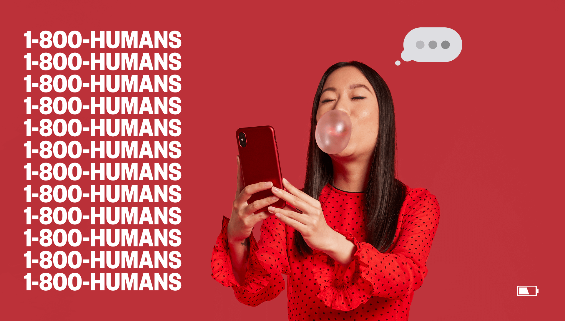
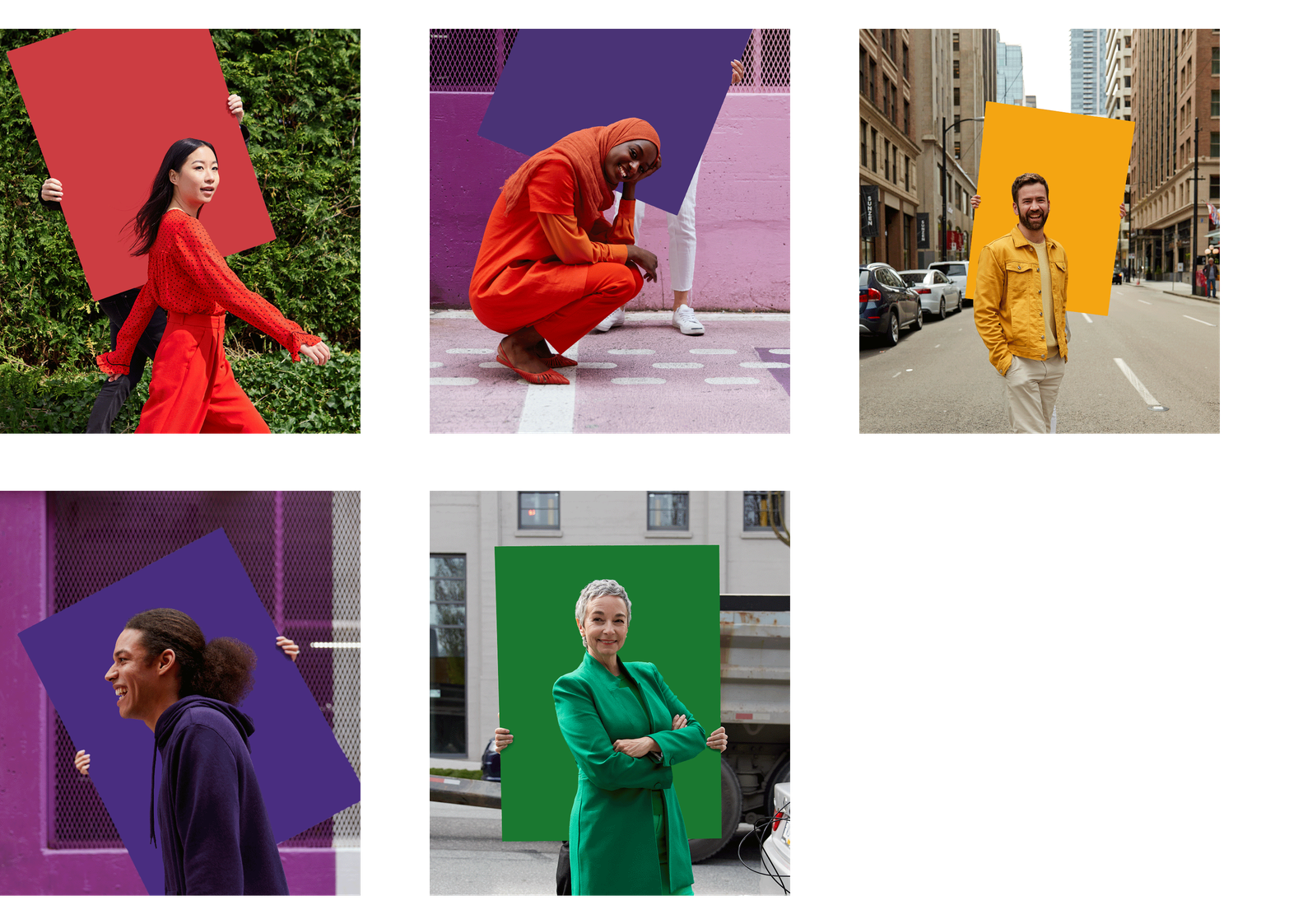
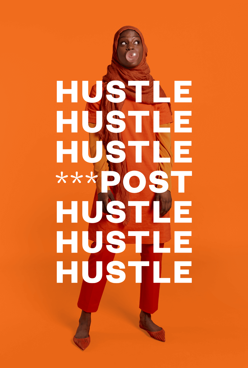
The creative process considered the history of the brand and identified key areas to develop through research derived from interviews with both internal and external focus groups. (Translation: we asked a lot of questions. Like, a lot a lot). This time greatly informed our creative direction where we recognized that Hootsuite was a technology brand rooted in human connection, yet this component was not communicated effectively throughout the brand. We worked with the Hootsuite team to update this perspective. Various forms of typography, photography and colour palettes were studied carefully in order to subtly update the brand with personality and depth while still keeping true to the strong aspects of the current brand identity.

Very Polite Agency Photograph

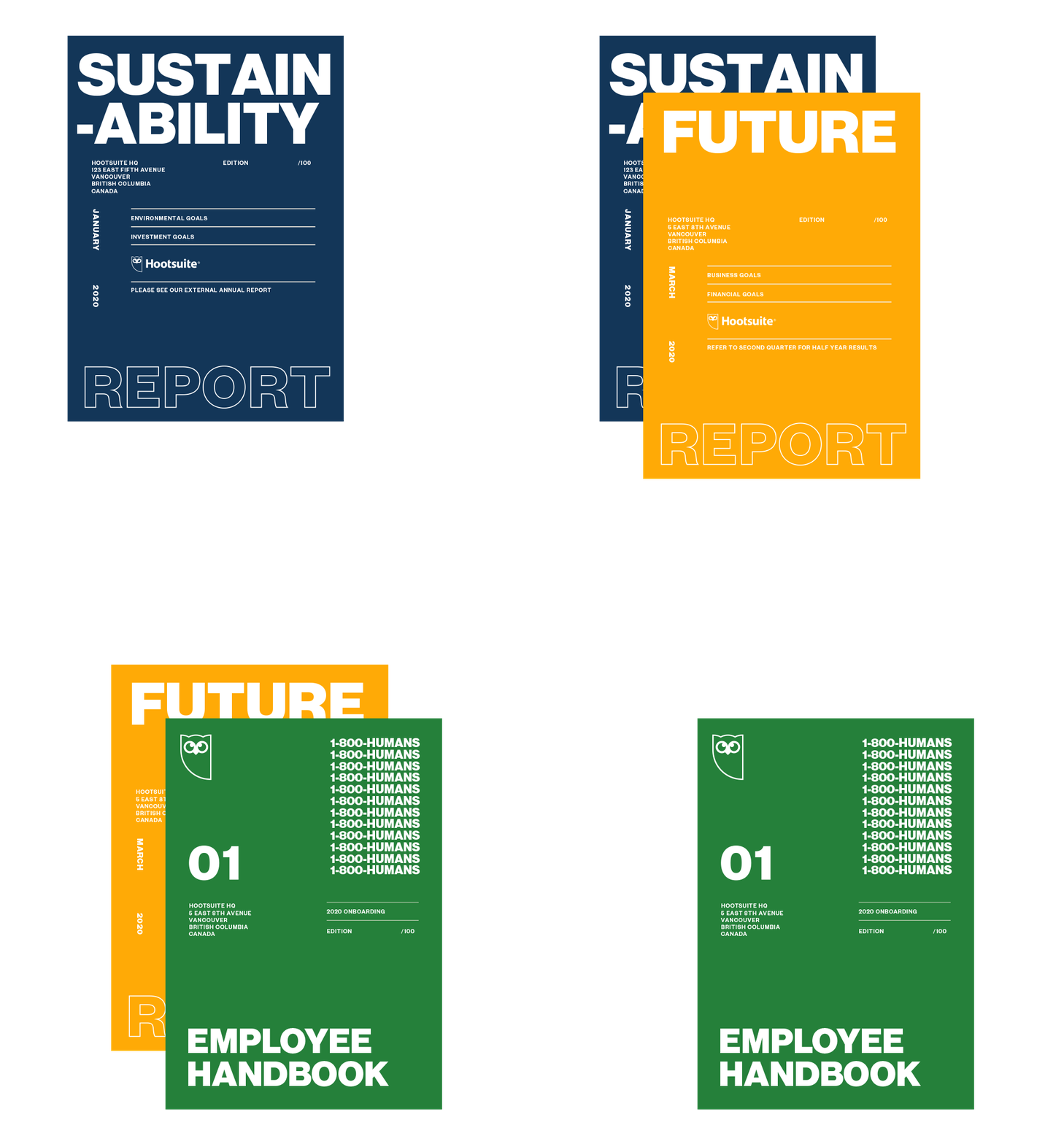
Image Caption about Brand book...

Very Polite Agency Photograph

The result was a comprehensive creative direction that aligned with the Hootsuite brand strategy. This involved updating the Hootsuite creative style guidelines with approved creative direction, colors, iconography, photography, type fonts, templates, assets, etc.

Very Polite Agency Photograph

Don’t worry, we didn’t forget about Owly! That would be rude. We deep dived into how we could infuse more depth and personality without changing the recognizable traits of this established brand icon. We realized that much of the emotion was conveyed through the eyes (just like with humans), and adjusting the pupils slightly for example, lent itself to a wider array of expression that was much more powerful.*

It also opened the door to greater diversity of “Owly” personalities to match a wide range of situations and responses, providing the overall brand with a boost of humanity.

Hootsuite is a leader in the tech platform and has pioneered a new way of information sharing and connecting. Through the brand refresh with Very Polite, the company continues to remain a leader in tech, with a brand that represents human connection in a digital world.

*No owls were harmed in the process.