Brüush

SVG-BRUUSH

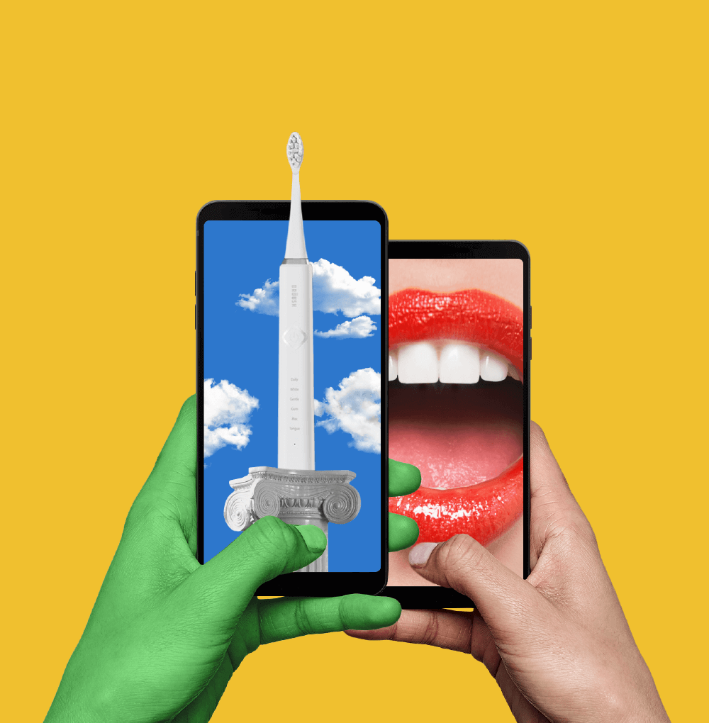
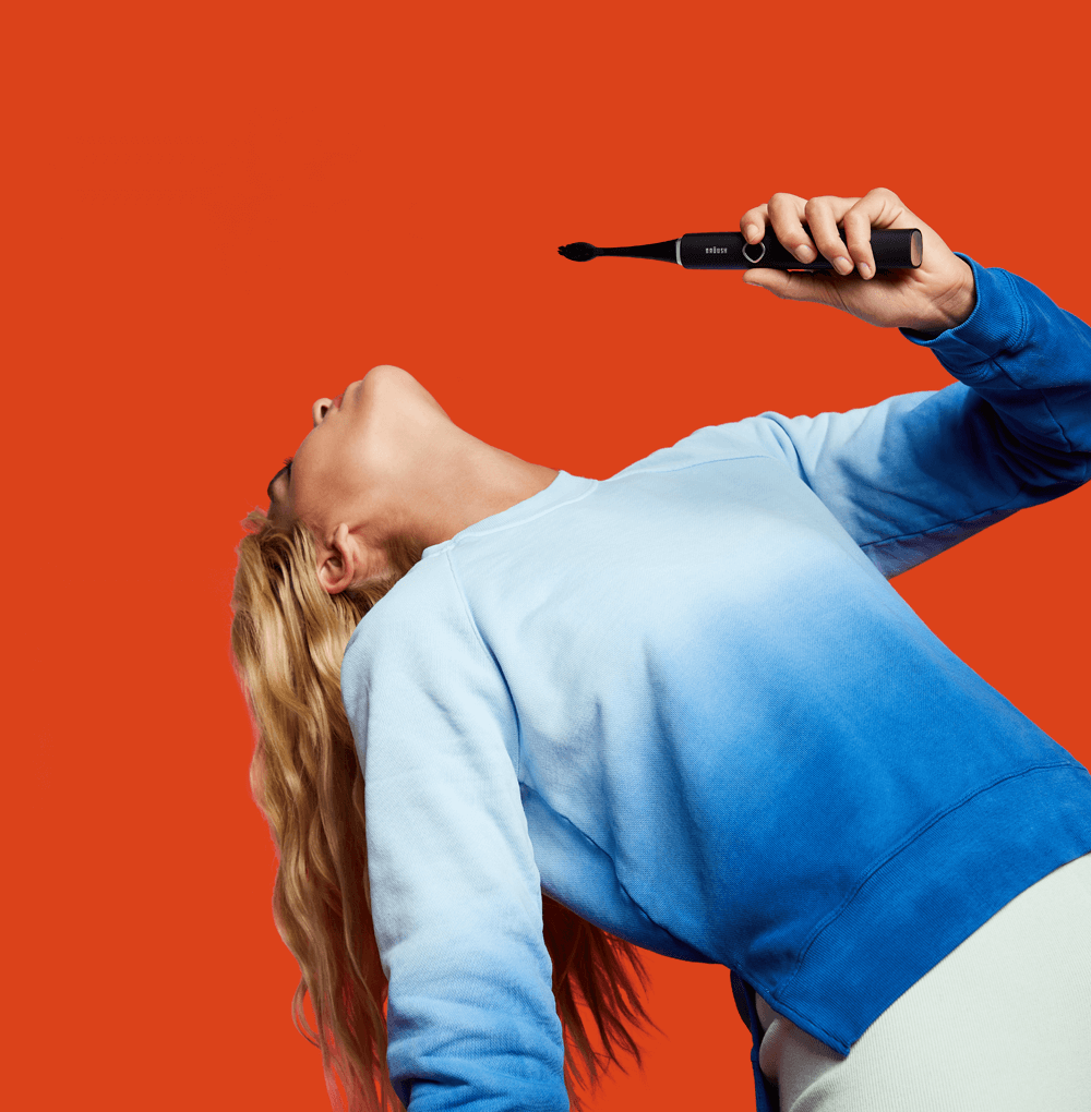
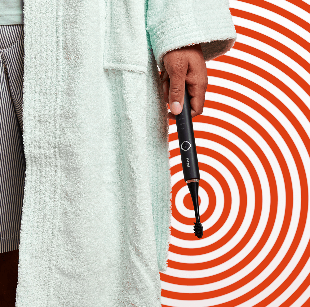
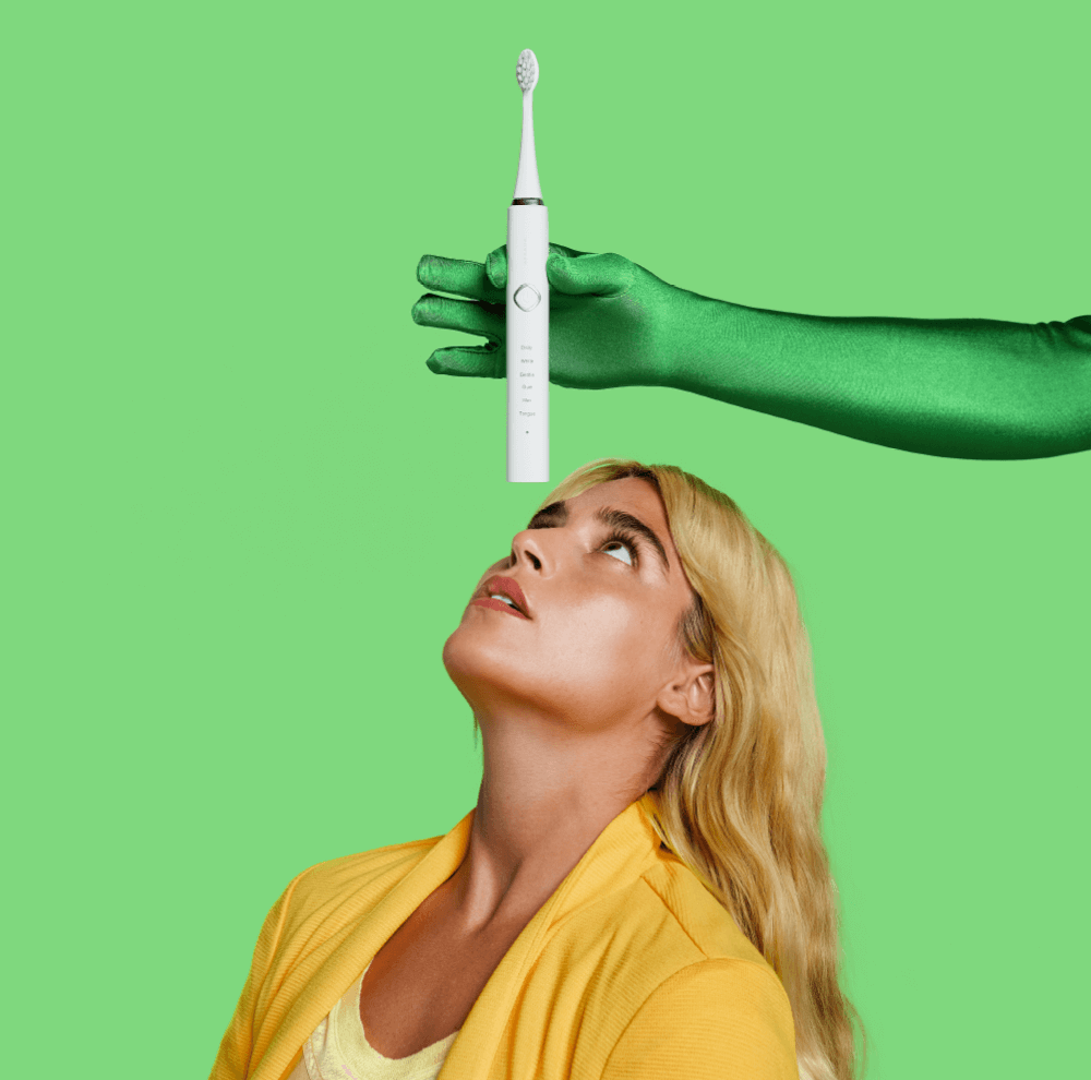
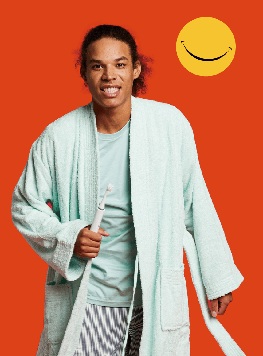
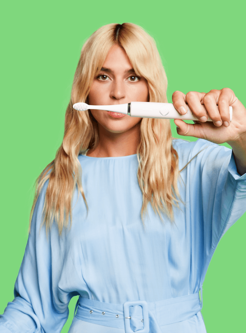
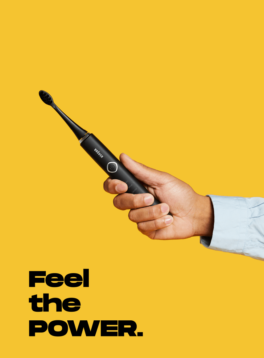
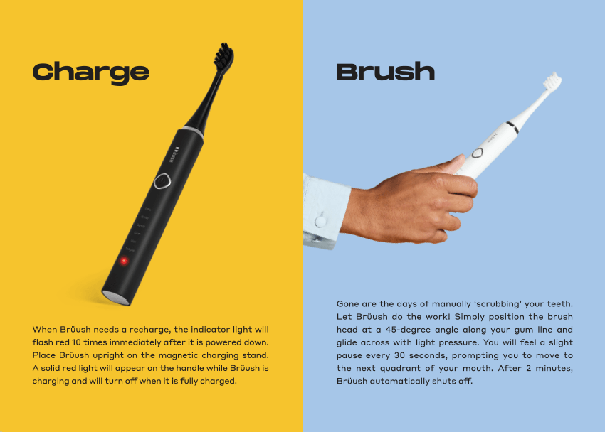
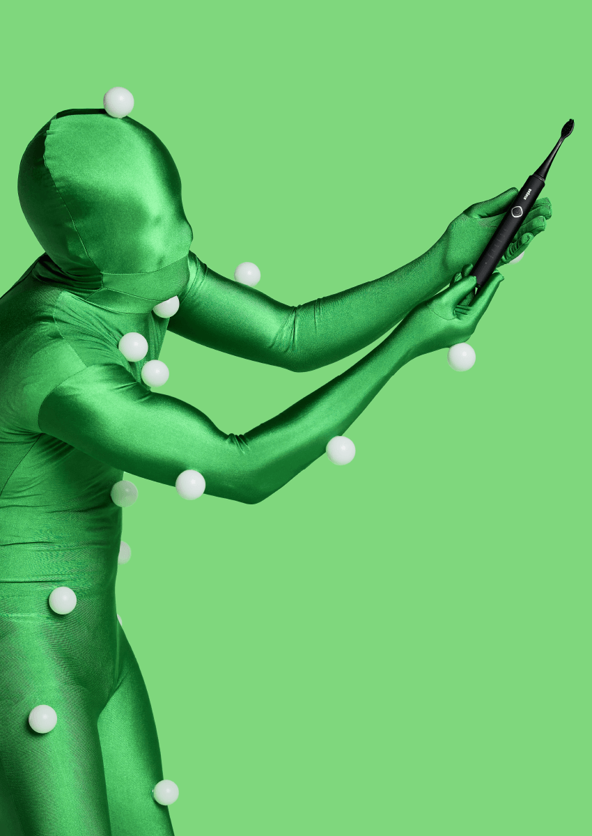
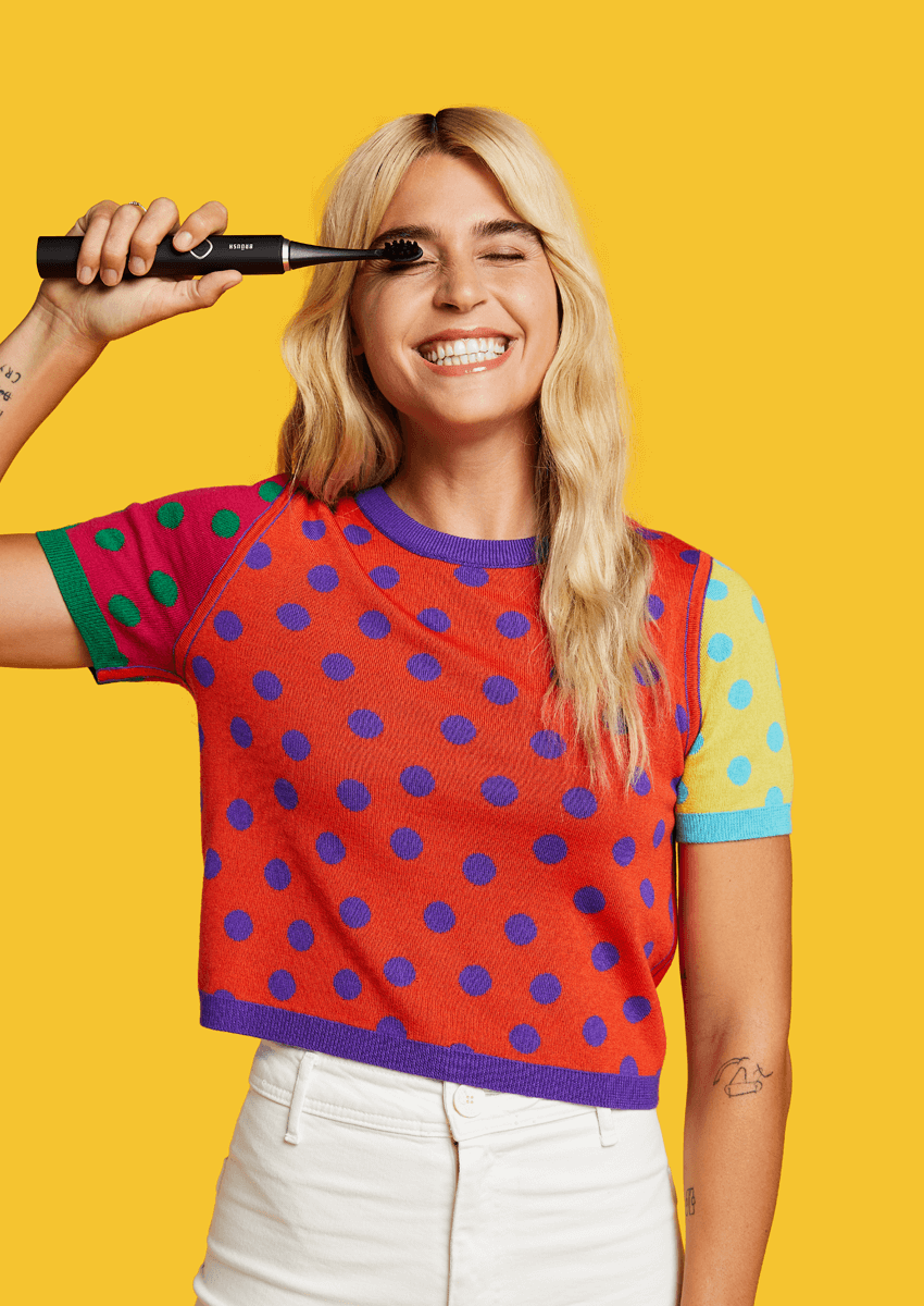
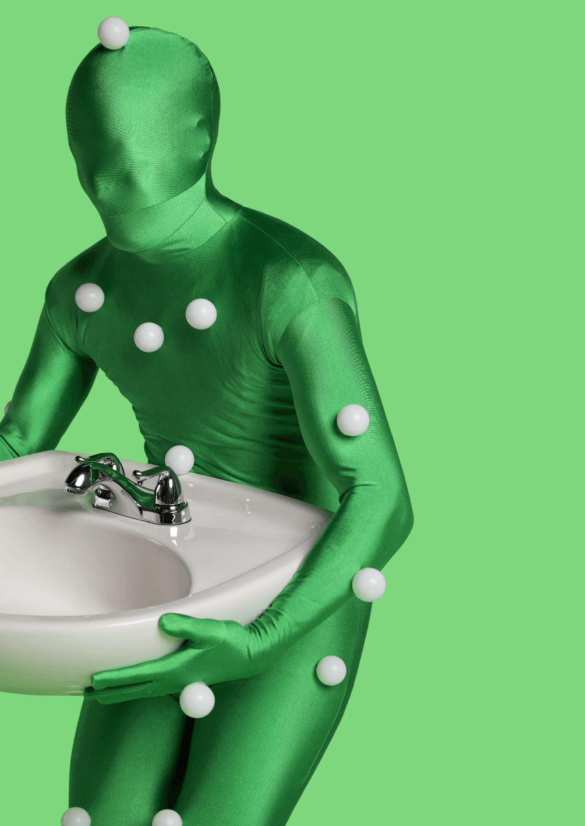
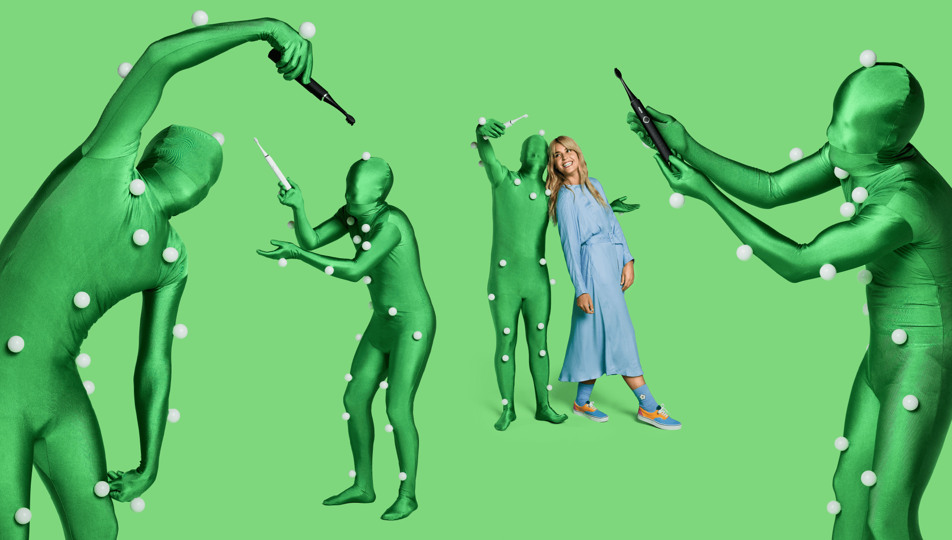
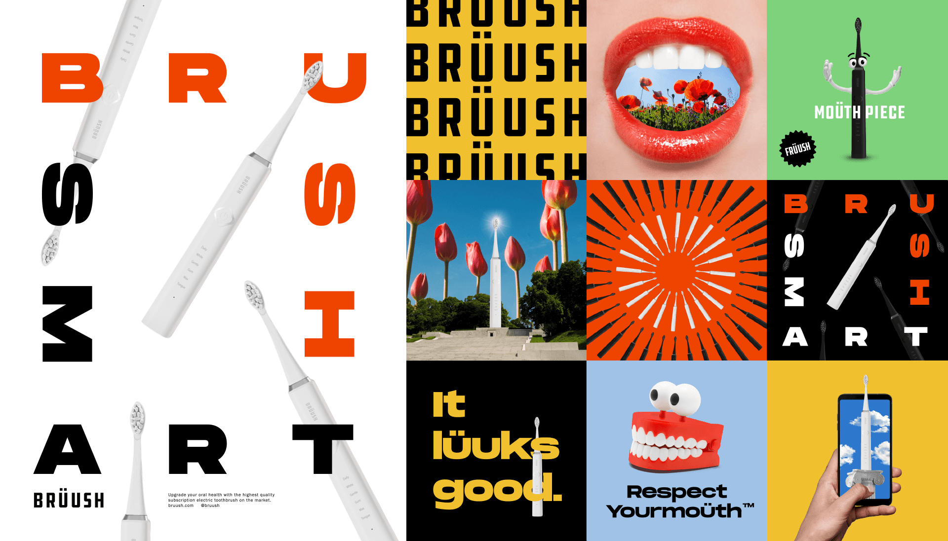
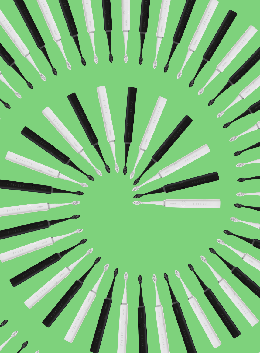
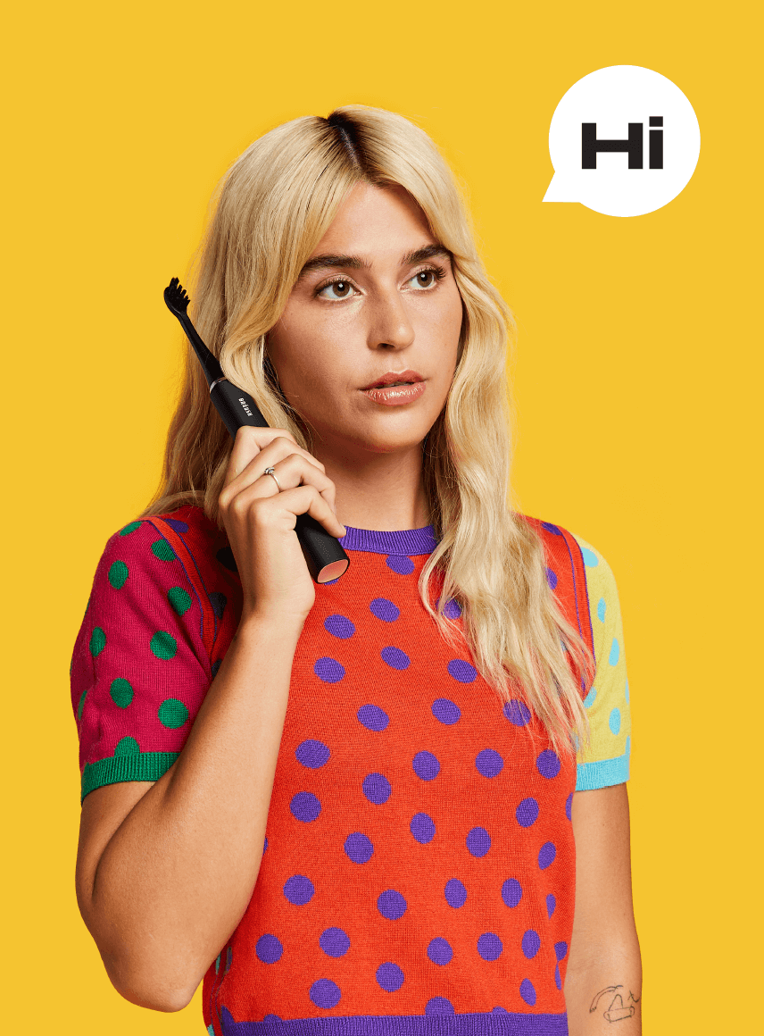
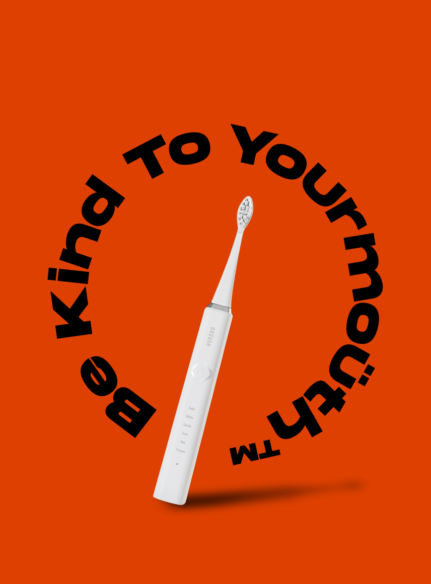
Brushing your teeth is traditionally not associated with humour, fun and personality. It’s well, kind of boring. We decided it was time to give this category a bit of an upgrade.

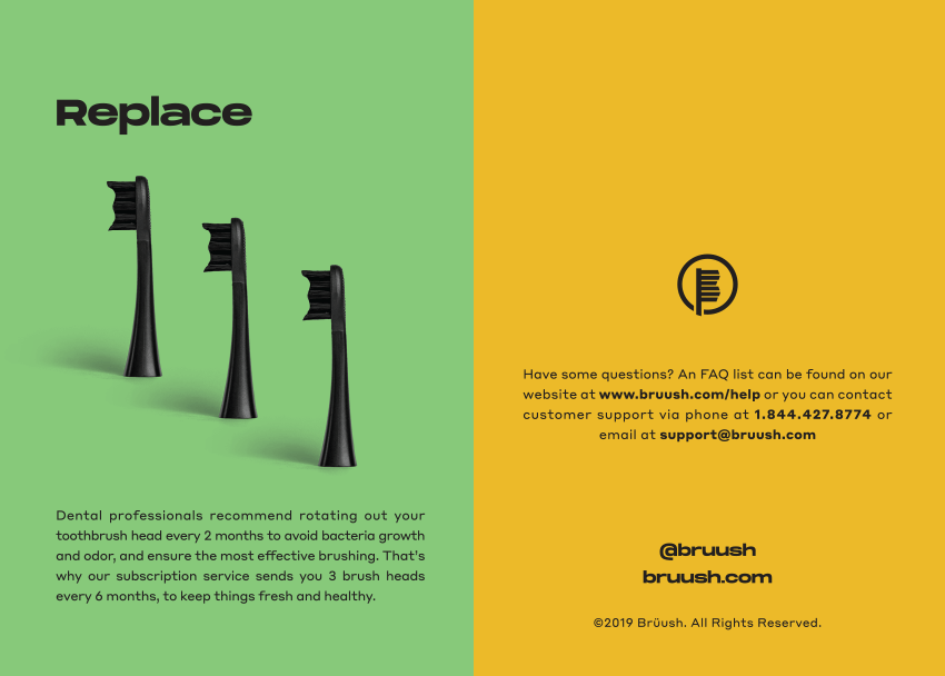
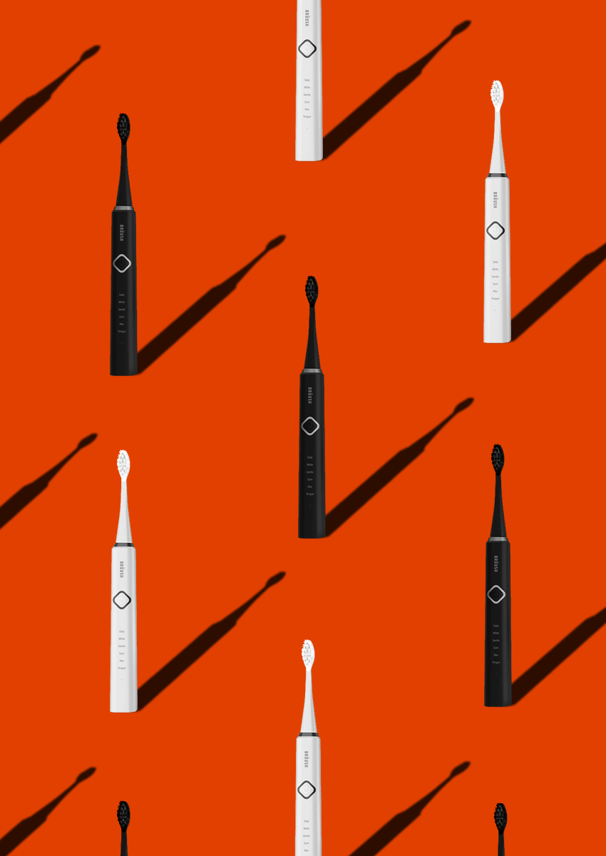
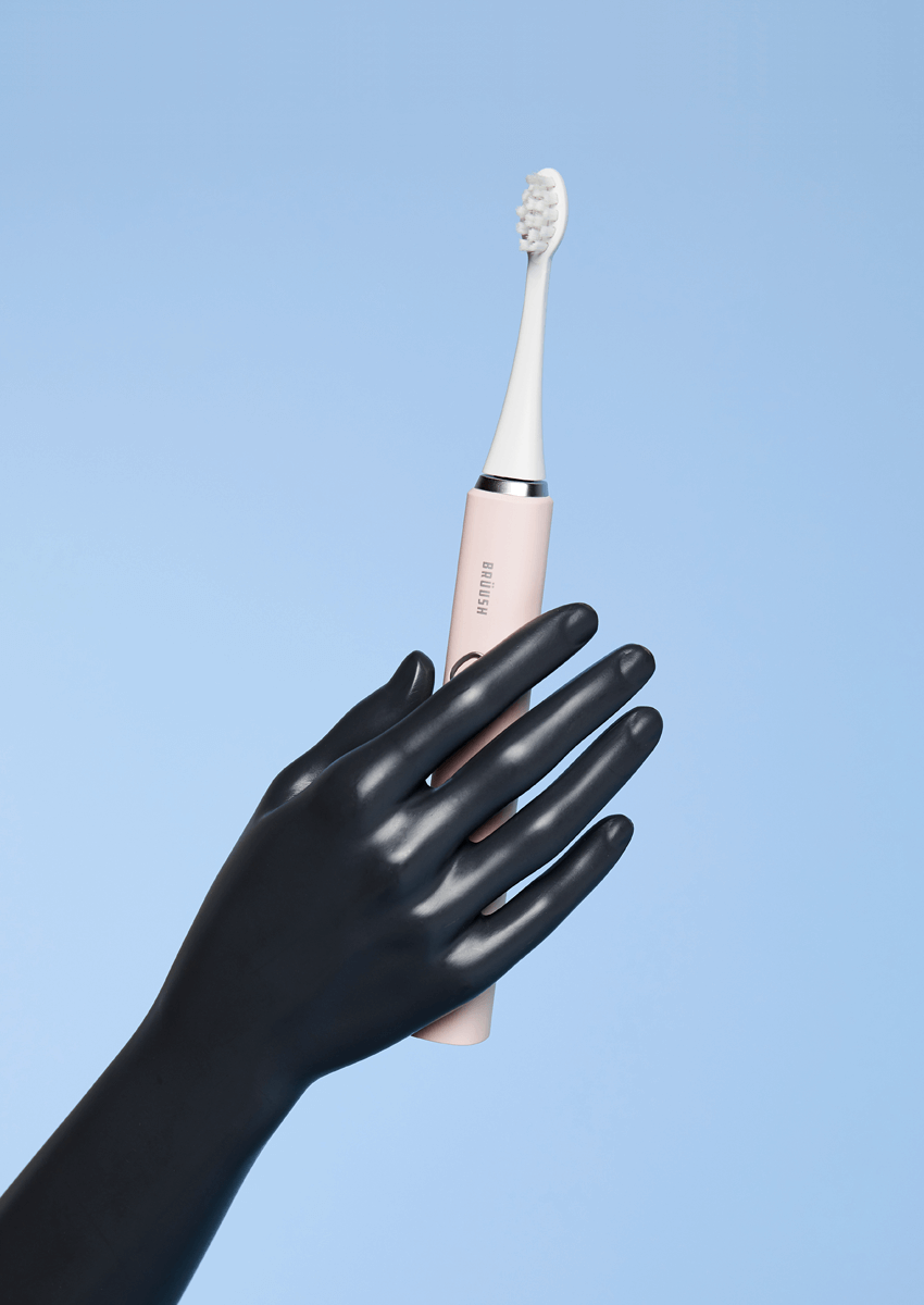
When Brüush approached us, they came to us with an already existing brand and an established product: electric toothbrushes with replaceable, subscription-based heads that would be sold exclusively online. Very Polite was brought on to refresh the brand including website design, new font, colours, brand voice and graphic treatment.

Very Polite Agency Photograph

After an intensive Brand Discovery Session, we came to some observations that guided how we approached the brand refresh. We established that Brüush was missing a differentiator in a very saturated market. There was an opportunity to present this essential, everyday, replaceable product in an exciting way that differentiated Brüush from the many competitors (Oral B, etc.) Within the current market, electric toothbrushes tend to look very similar, come in the same offering of colours, and generally lack personality. As a result, we had to find a way to infuse something dynamic into Brüush in a way that made sense, that considered the online market, and offered something new and enticing to loyal consumers of other brands.

Very Polite Agency Photograph

As part of the Brand Voice development, we created the principle of “Respect your Mouth” – the tongue-in-cheek principle of being kind to your mouth, respecting your mouth – essentially a personification of the mouth, an area that is often overlooked, but so important to overall health. We wanted to disrupt the market with authentic and humour-driven language that still spoke to the function and benefits of the product, and that would thrive on social and web.

Very Polite Agency Photograph

When it came to the visual aspects of Brüush, we realized there was a void in the market for vibrant design that was the opposite of the clinical, sterile identity of their competitors.

The graphic treatments that existed when we initially started the project were primarily black and white – accented with muted pinks and similar tones. We decided to pump up the colour treatments, bringing in red, green, yellow and blue – unexpected palettes that would stand out on every platform (and especially on a bathroom sink). We lent the same perspective to the iconography, changing it to a bolder format that was more engaging to the consumer.

Very Polite Agency Photograph

As part of the web design, Very Polite produced and concepted a photoshoot which infused the newly branded identity as well as an element of ‘surrealness,’ giving Brüush quirkier and bolder campaign imagery. We didn’t want to use the traditional bathroom setting, so rather brought in tiling and other features to give a ‘bathroom’ atmosphere but in an abstract way that hadn’t been done before.

We extended this imagery to live on their social channels and marketing materials. The result was a dynamic, exciting interpretation of an otherwise basic functional tool (which hopefully lead to fewer dentist visits).