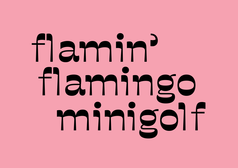
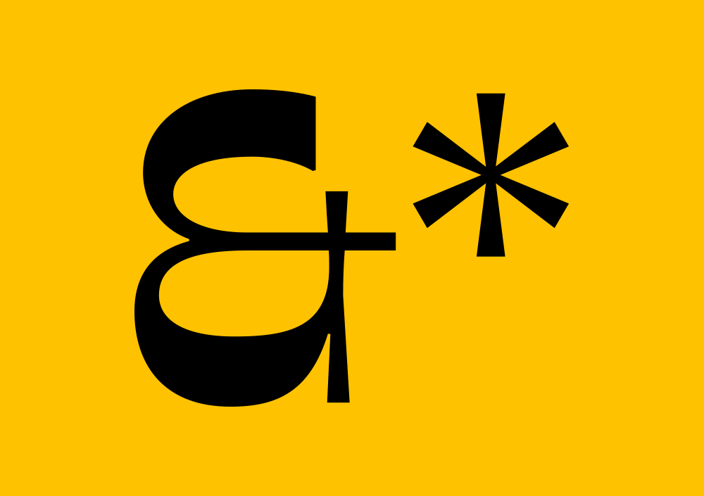
Not Sorry Serif

Asset 17

In contrast to our primary brand font, Sorry Sans, Not Sorry Serif (a Reverse Contrast Serif) was always meant to be a font that was more expressive – something that looked unique while maintaining familiar attributes.

Very Polite Agency Photograph

NOT SORRY SERIF CHARACTER MAP

Very Polite Agency Photograph

We often say we wanted to design a font reminiscent of a 1970s Japanese Donut Shop – which is a very befuddling way of saying we aspired to create a radical and unexpected style that had slightly nostalgic qualities.

Very Polite Agency Photograph

In actuality we were inspired by Japanese influences while researching design for our Mr. Yuzu branding, and were particularly drawn to the flourishes seen in Japanese calligraphy that were emotive through their movement.  We wanted to capture this form of expression and somehow meld this with the humour and ‘happy’ qualities of the emoji – our theme of the year. We were inspired by the exuberance of posters from the ‘70s which told us to “have a nice day!”

Very Polite Agency Photograph