ALT
Cannabis culture has come a long way from the granola, hippy or pop culture stereotypes we grew up with. When ALT approached us for a complete brand identity package for their proprietary liquid cannabis formula, we had an opportunity to take this new brand to a higher place (sorry, we had to).
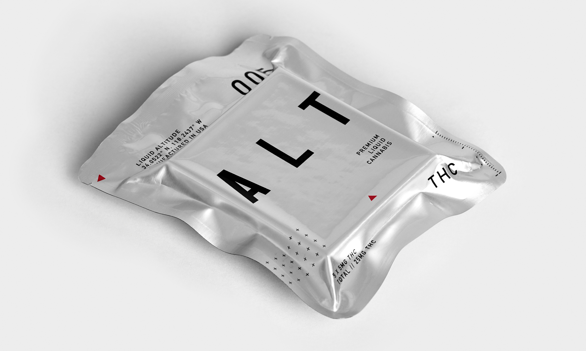
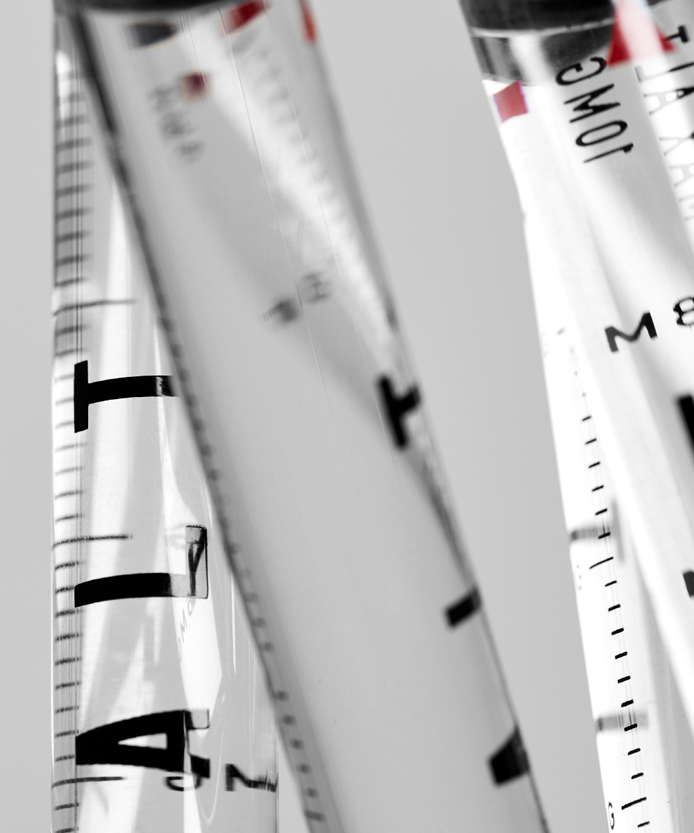
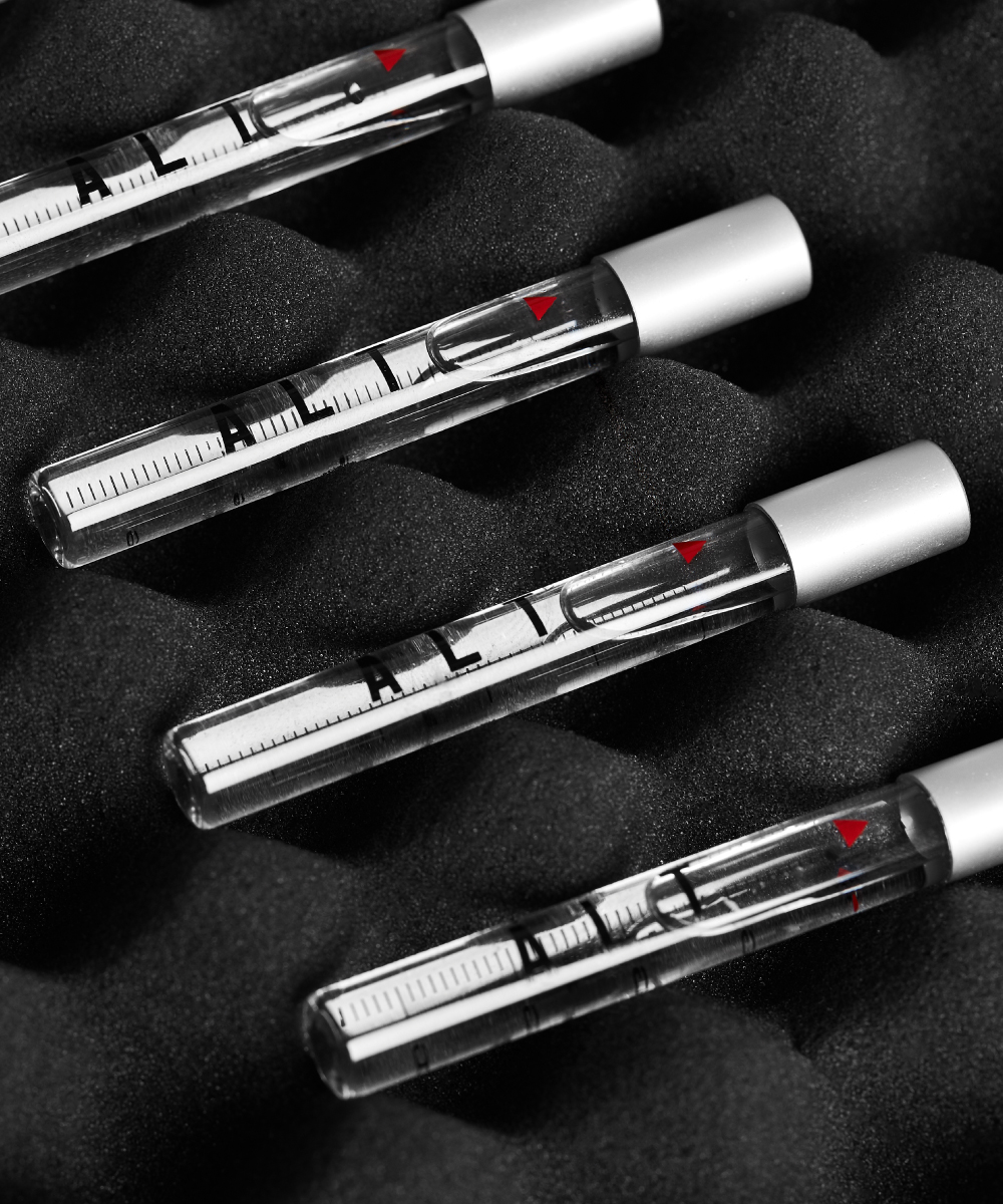
It started like this. The ALT team approached Very Polite with a product in development intended to be the cleanest possible form of cannabis in the market. A water-compatible, odorless, colorless, liquid THC formula. At this point, there was no established brand identity, and so by developing the brand from inception to final product, we were able to bring something unique to an emerging market.
Following an immersive brand discovery process and understanding more about what ALT wanted to achieve, we started to imagine a future where this product could deliver a specific and measured high in the cleanest possible way.
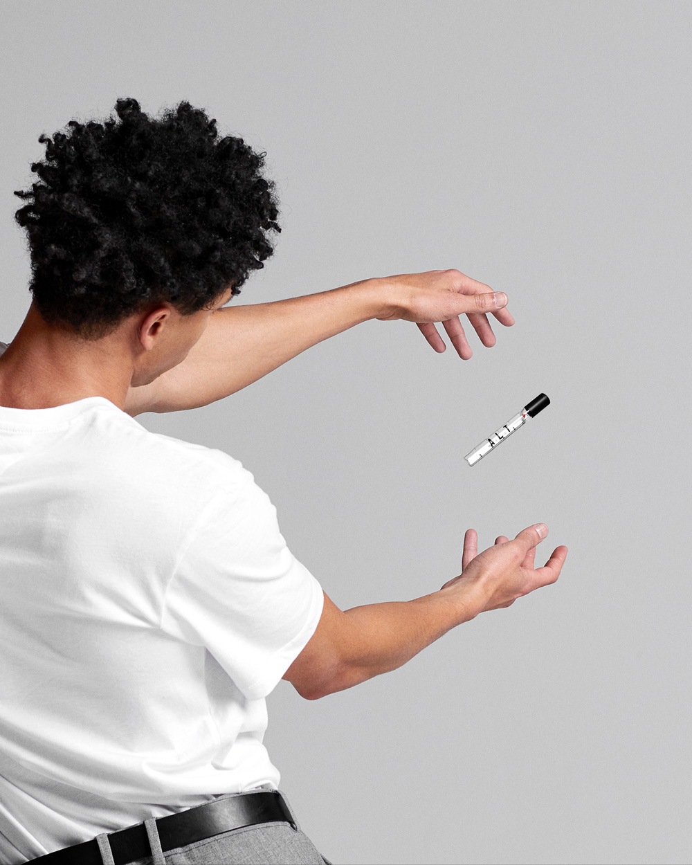
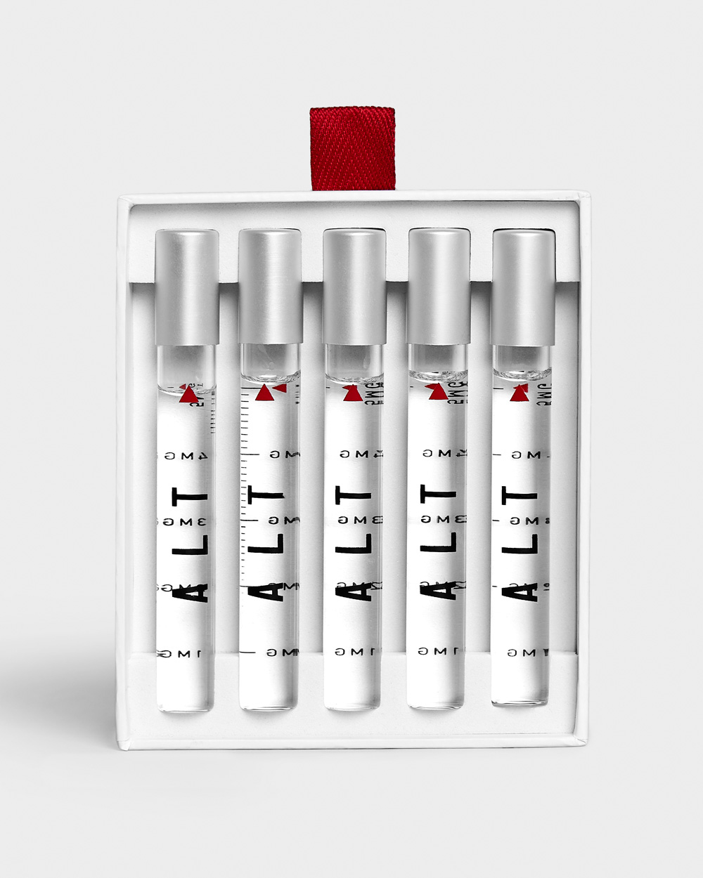
ALT was rooted in scientific development, an element which we wanted to pull from without it feeling pharmaceutical. We uncovered an aspirational component grounded in science and perfected in the quest to get man to a higher place, both literally and figuratively: a future state. Sign us up.
It captured the potential of cannabis mirrored with the potential of ‘recreational self-improvement’ and what the product can do for us. Space exploration, and humankind arriving on the moon is also the story at a very micro level, of what the product was trying to tap into – a step into possibility and new perspectives – expanding human potential.
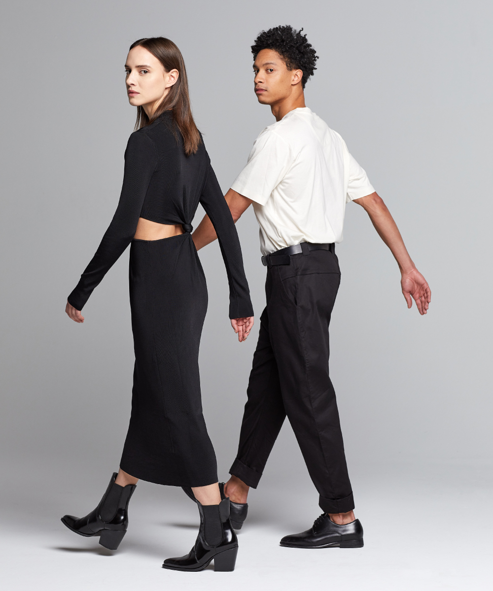
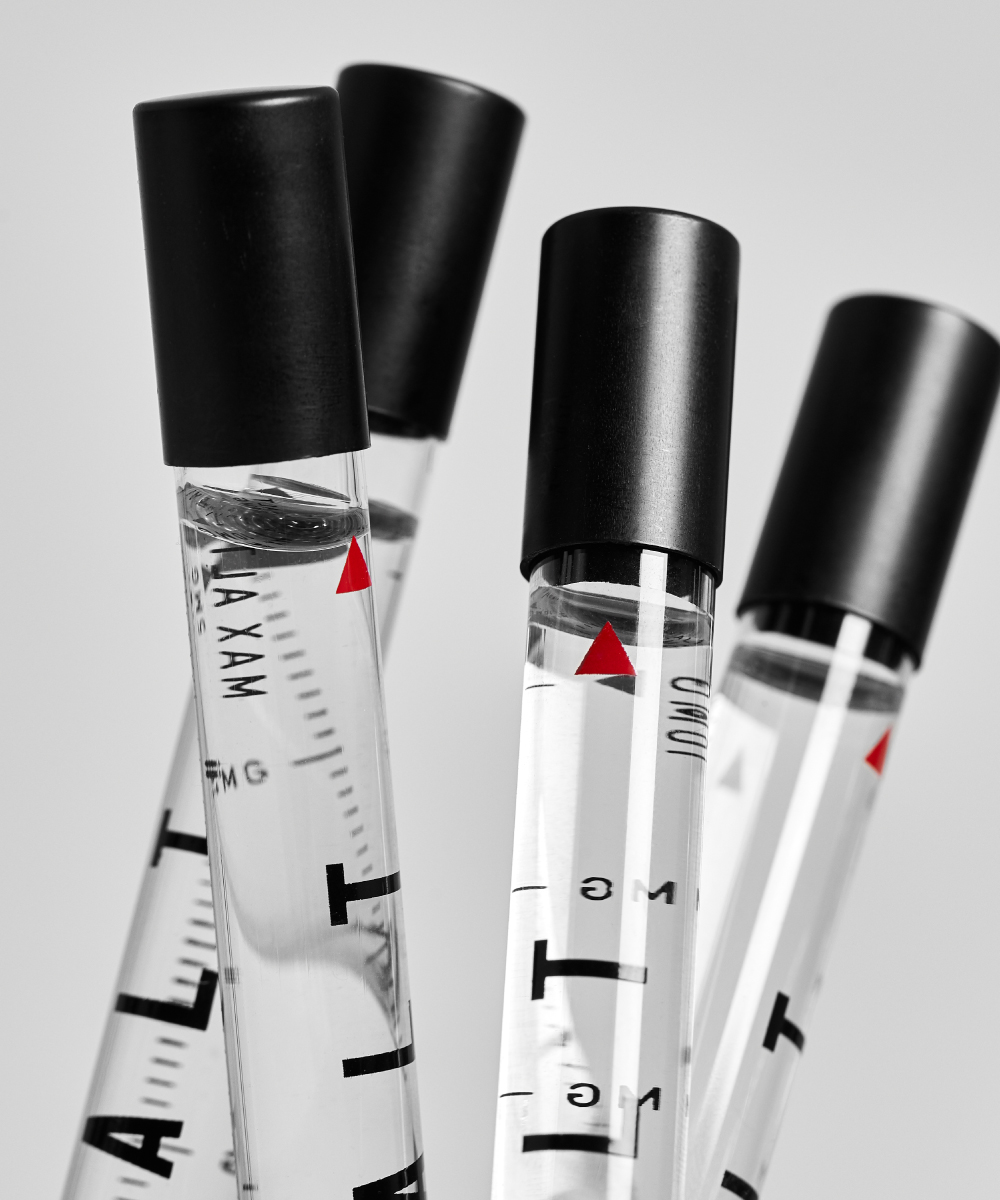
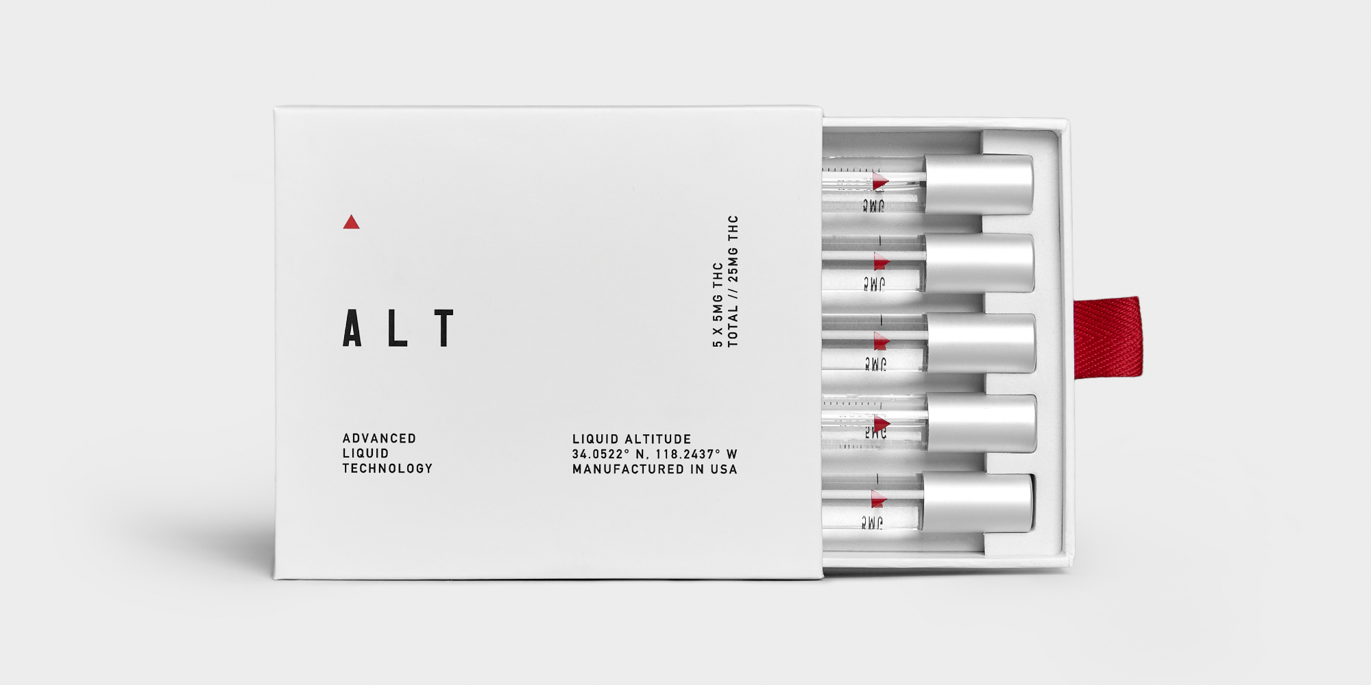
We were drawn to the idea of this kind of aspirational performance (TBH, who wouldn’t be) which then connected us conceptually with aeronautics, aviation, and those type of futuristic visuals that we found had an inherent elegance to them. The engineering to astrophysics and even the food packages that astronauts would use, on some level referenced a journey into another type of reality.
Based on this understanding, we came up with four concepts to present to the client, as well as naming and aesthetics. We ultimately landed on the name ALT – a play on altitude and altered state, reality, universe, perspective, and enhanced version of yourself. Eventually, this evolved into a pretty handy acronym: Advanced Liquid Technologies.
Once the name was established, the design direction organically took shape – inspired by high altitude fighter jets, precision, and a streamlined, clean aesthetic. This direction also informed the packaging design, the custom brand font, and the graphic design elements found throughout the brand’s materials. The team researched various foils for the outer packaging and were influenced by the nostalgia evoked by vacuum-sealed, sleek packaging that we learned as kids was how food was consumed in space. (Note: The Jetsons were not included in this research).
In addition, we developed a detailed go-to market strategy including the deployment of the website which we designed and launched, developed supporting video assets, visual content and production.
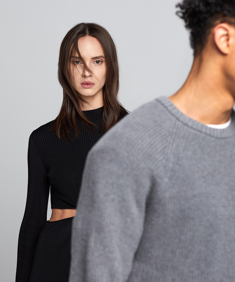
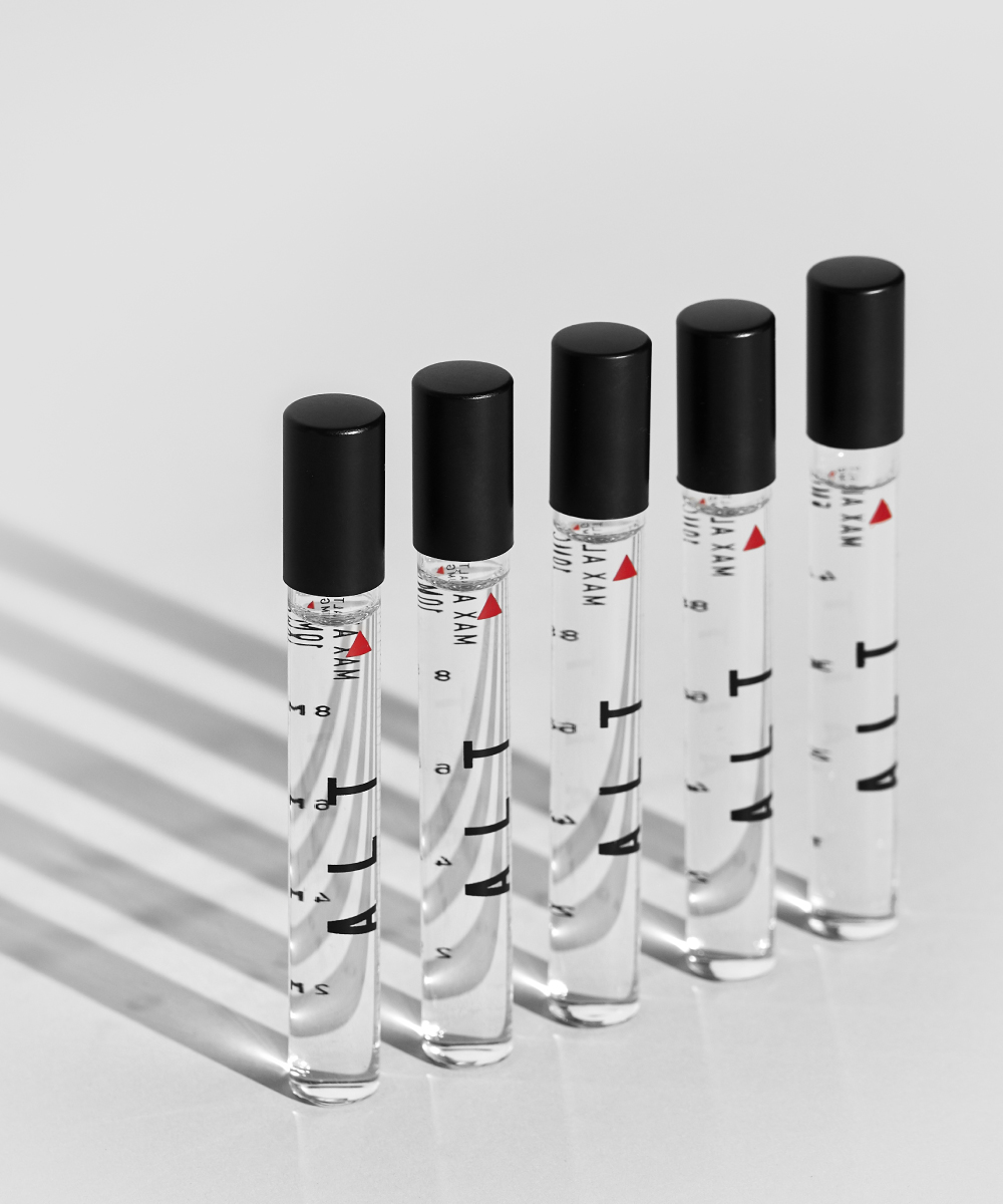
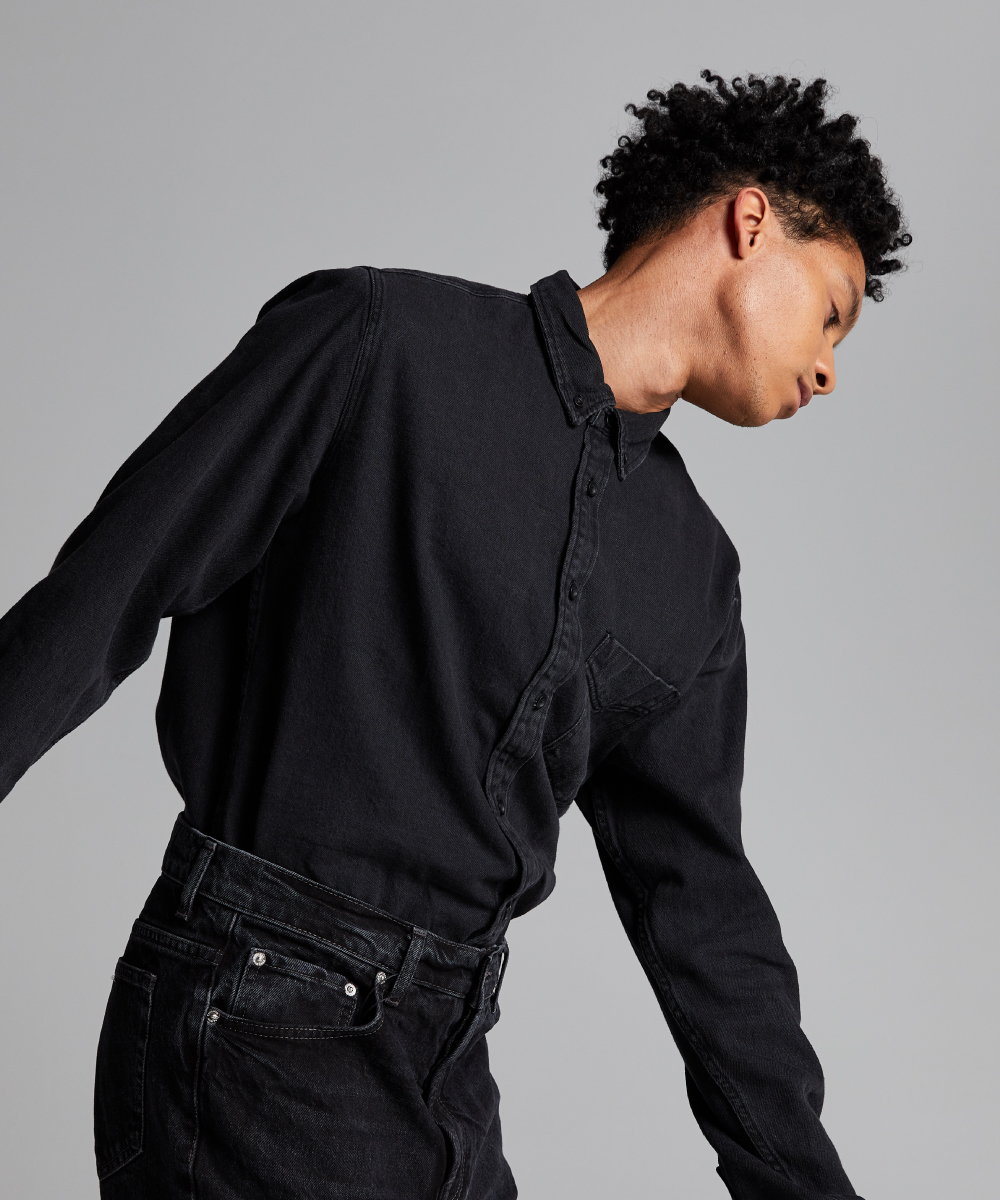
Ok, so here’s why ALT was such a trip (in the best way). ALT to us was a deeper exploration of the mind and made us think about where we were as humans, which aesthetically and conceptually fit with space exploration – and all the potential and discovery that comes along with it. The result today is a fully realized brand that is positioned to launch in a saturated market with a strong identity, messaging and unique product positioning.
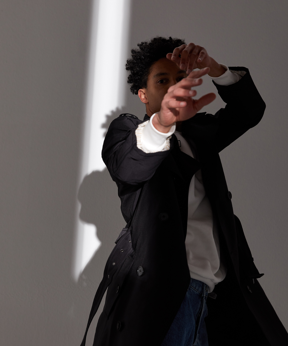
Models: Jordan Cooper (Stranger), Sara Borowski (Stranger)
Stylist: Caitlyn Beattie Hair: Erin Klassen (Nobasura) Makeup: Hyesoo Sohn (Nobasura)